A/B TestingImprove your website's performance one split-test at a time.
You're here so you know that it's important to make your website accessible to people with disabilities (if there's still any doubt, check out the growing trend of website ADA accessibility lawsuits or see what it's like to use the internet with a disability).
But making your website accessible can be difficult - where do you start and what are the most important steps to take first?
In this post, I want to help make achieving accessibility easy for you with 9 simple things that you can do to make your website more accessible immediately.
These require access to your site's code, so if you don't have that or don't feel comfortable, we can help. Be sure to check out and consider our accessibility plans today!
Non-text elements describe any web page element that isn't text - like images, videos, audio, etc.
It's easy to recognize potential pitfalls for disabled individuals with content like this. For example, if you're visually impaired then you can't see images or videos (at least clearly) and if you're audibly impaired then you can't hear videos or audio files.
The most commonly used element of this group is hands-down images. We all use images on our sites but how many of us add a text-alternative to every image?
This is as simple as adding an alt="" property to the <img /> HTML tag.
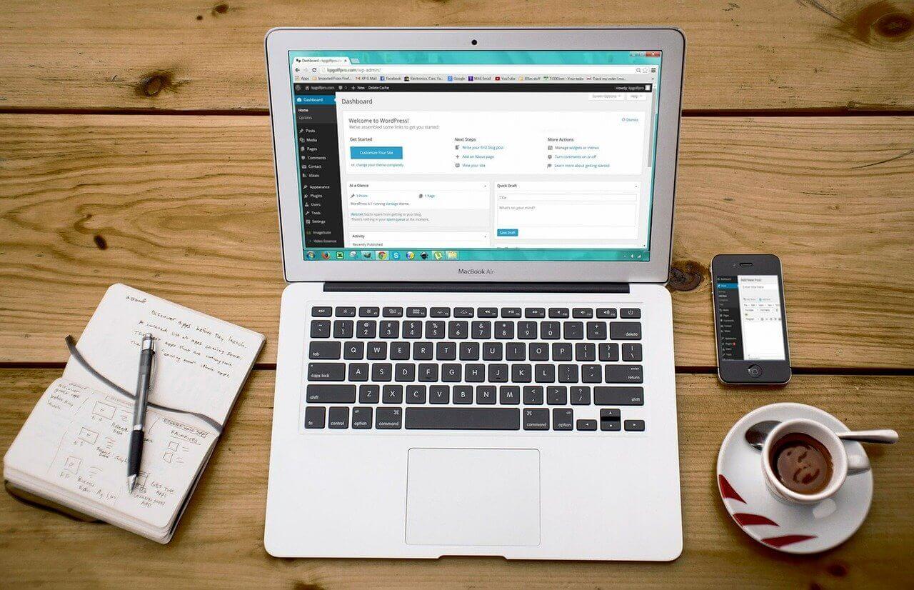
Quite simply, use the alt property to state the content of the image. Consider this image:

An appropriate alt-property here might be "woman sitting on couch using laptop". Then, the entire HTML tag would look like this:
<img src='source.jpg' alt='woman sitting on couch using laptop' />
By adding this alt-property to your image tags, individuals with visual disabilities can now receive the same level of experience as your non-disabled users.
How many of the following types of interactivity does your website contain:
Now think about how your user performs actions on each type of interactivity. Do they have to click a button? Move their mouse over a certain element?
About those elements and buttons, are they stated as such in the form of text or do they rely on the user being able to see and distinguish color? Maybe ... click on the green button to submit the form.
It may be fun for you, but it may be a nightmare for someone with a disability!
Something else that might be fun - playing audio on your webpage.
Maybe this is less common today than it used to be, but many people still like the differentiation that it provides to their site.
I'm actually all for it, as long as it's an option that I can opt into. Yeah, boo ... I know, but imagine having an anxiety disorder, visiting your website and having to take in your visuals, text AND audio all at the same time.

Imagine having an anxiety disorder and having to take in your site's visuals, text AND audio all at the same time
The technical accessibility rule regarding audio is that if it plays automatically and for more than 3 seconds that there exists a mechanism independent from the system to control the volume.
But I would just recommend that you keep it silent automatically.
Yes, we all like how text looks over images ...
But if I go just a shade or 2 down on the background, you can see that we start running into serious problems distinguishing between the text and the background image.

This text wouldn't be distinguisable by many people with visual disabilities that require high contrasts. You might think that you wouldn't ever make the mistake of the 2nd image above, but maybe you'd designed your site and now you're looking to make a quick change to the background image. Maybe the new image has more white in it - don't forget to also update the shading to compensate for the reduction in contrast!
Another easy way to quickly boost the accessibility of your website is to increase the space between your text.
Good techniques to follow include:
Basically, don't be afraid to white-space it a little, especially on your pages that include a lot of text.
Yes, there are a lot more requirements than the 5 mentioned above. I'll work to provide tips for those at a later time, but, for now, work on the 5 accessibility optimizations above or sign up for Gazeble to do most of the heavy-lifting for you!
Comments