A/B TestingImprove your website's performance one split-test at a time.

A quick search of website accessibility on the internet tends to return many archaic-looking websites.
Maybe it's because web accessibility is given less focus nowadays, or maybe the best resources in the industry have just been around for a while.
Whatever the reason, don't be led to believe that your website needs to be accompanied with a poor design in order to be ADA compliant. The truth is, there are a number of things that you can do to your existing website design to make it accessible.

Don't be led to believe that your website needs to be accompanied with a poor design in order to be ADA compliant.
Here are examples of 6 modern-looking websites and how they've made different elements of their websites accessible.
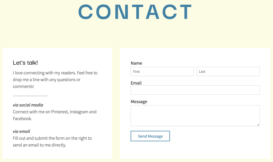
One way to make your website accessible is to add labels to your form inputs - not just placeholders. Labels are typically the text above or to the side of where you input the text and placeholders are typically the lighter-colored text inside of the input fields.
SunshineDays Blog does a great job of using labels to properly identify form input fields on their contact page.
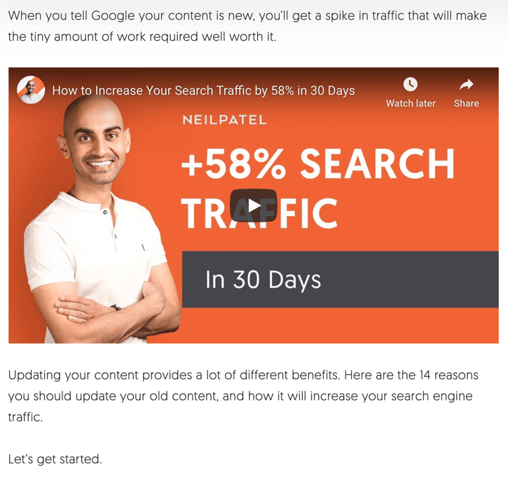
Videos are a great alternative way to provide content to your users - some people even learn better when watching a movie rather than reading text.
But, the problem is, that after you spend the time and resources to put together and upload a video, it's tough to dedicate time to providing a text-alternative to that video. But that's a must when it comes to accessibility.
Neil Patel does a great job on his site with videos. He puts the videos together but then also reiterates the same content in a blog post - giving the user 2 different ways to consume the content.
Not many websites include functionality for resizing text (even though it's actually a requirement at the AA compliance level).
And it's true that you can't fully control how your website looks when text is enlarged by 200%+, but we think that our accessibility user interface provided in our website plans is an elegant solution for enlarging text.
Something else that is required for ADA compliance but isn't required to look clunky, is some form of outline or highlighting to appear when an element is focused.
What does it mean for an element to be focused?
An element is focused when it has been selected by the tab key on the keyboard and will perform a function when executed.
The problem with some websites is that they have gone farther than necessary to make their elements stand out when a simple outline will suffice.
Here's a gif of a local insurance company's website where you can see how the tabbing of the keyboard moves the focused element.

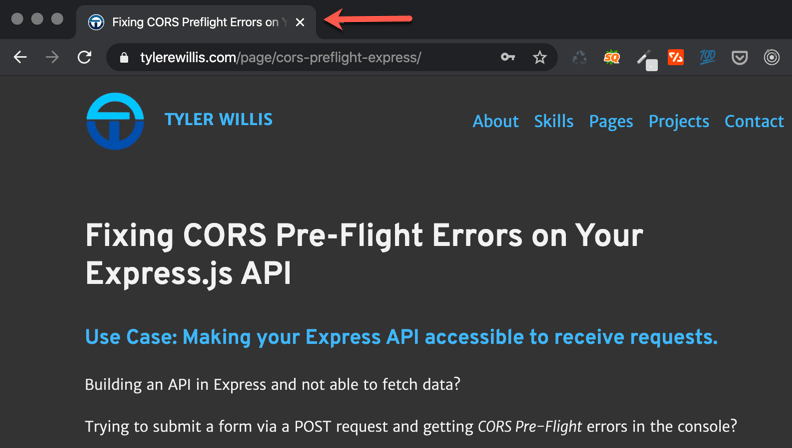
Optimization of web page titles
Page titles refer to a single line of text that is displayed on search engines and browser tabs and set using the <title> HTML tag.
might be something that you've heard about in regards to search engines, but did you know that each page having a descriptive page title is actually required for ADA compliance at the single-A (most basic) level?
At my personal blog, tylerewillis.com, I do my best to be sure I'm using descriptive page titles for my posts.
Speaking of keyboards, all functionality on your webpage should be executable by a keyboard - not only a mouse. So every mouse-click or hover action must be accompanied by keyboard button presses.
A common example of functionality present on web pages is a banner or image-slider with clickable arrows to advance or retreat through the slides. The United Way website has a banner slider that can be navigated by either a mouse or keyboard.

Hopefully making your website accessibility seems both more attainable and desirable now that you see the design of your website doesn't have to be thrown out. Be sure to subscribe Gazeble Backstage below to get some additional examples sent straight to your inbox!
Comments