A/B TestingImprove your website's performance one split-test at a time.

It can be difficult to empathize with someone who can't navigate the world like we can.
As someone who has had multiple mission-trip opportunities to serve people with extreme needs, a week or 2 after being back home again I would tend to forget the perspective I gained of how others lived their lives differently than me.
I would return to my own little bubble and selfishly focus only on my own perceived needs.
It's those that don't, and ...


It's those who remember the gained perspective and take action that change the world.
In this post, I want to help you gain a new perspective - that of how someone with a vision, hearing or cognitive disability and how they navigate the internet.
In this exercise, I'm going to draw your focus to your own website and how disabled individuals may be experiencing your website.
In another post, I shared that approximately 4.6% - or 10.8 million - adults in the U.S. have some form of visual disability.
This percentage accounts for visual disabilities that are not easily corrected (like getting a pair of glasses to see perfectly).
These disabilities include:
Visual disabilities, regardless of whether or not they are of the extreme or less-extreme nature, lead to the following challenges when using a website.
Perception is ability to see, hear or become aware of something through the senses. This would present difficult or impossible situations for those with visual disabilities when website elements like graphics, layout or color-based cues contain key controls.
Let's see a couple common examples where this might present a challenge ...
Having some sort of image or banner slider on your website is very common, but did you ever think that arrows on the sides - the ones allowing you to advance or retreat a slide - create a perception issue for individuals with visual disabilities?

Those with vision can see the arrow graphics and don't have a problem understanding their purpose. But, unless labelled properly, a blind person will be forced to miss out on any important information hidden on additional slides.
If a website ever directs a user to view or perform an action on an element based on the color of an element, a color-blindness issue likely exists.
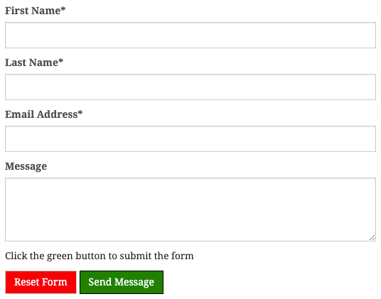
Take this form for example ...

If you have a hard time distinguishing green or at least distinguishing it apart from red then you'd have a problem submitting this form.
A person with no visual disabilities would likely operate your website with a common mouse pointer. Those
with disabilities operate your website by means of the keyboard.
This is primary done with the TAB key for navigating links and clickable elements and the ENTER/RETURN key for executing actions.
Try this exercise - the next website or webpage that you visit, try navigating the page with only the 2 keys mentioned above.
What do you think? Difficult? Can you imagine actually doing this blind?
Were you able to access all of the content? The problem with operation via the keyboard is often developers build websites thinking primarily of the mouse with functionality occurring via mouse-click or mouse-hover actions.
Refer to the sliding banners that we discussed above and the graphical arrows that allowed you to advance or retreat the slides. In many situations, those are not operable by keyboards and the TAB key.
There are some websites that are built with amazing design. Just perform a quick search and you'll see websites with hundreds of elements consisting of smooth animations and clever sequences.
The problem is that many of these websites don't make sense linearly.
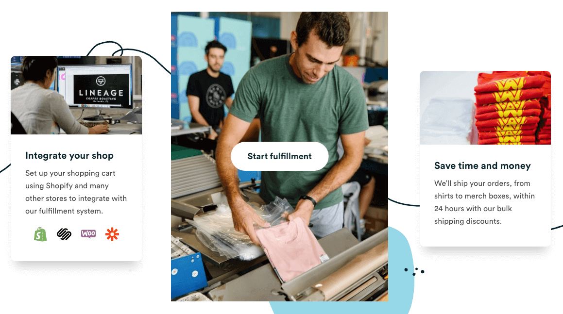
Consider this webpage that shows 3 elements left-to-right:

On the screen, I can see that the order of content is:
However, when I look at the order that the content actual appears behind the scenes, the order is:
Now, in this example, this doesn't appear to be a problem. But can you think of an example on your site where you have moved content around to fit the design scheme that might actually put the content out of order?
If you're visually impaired and using a screen reader, the screen reader will read the content how it appears behind-the-scenes ignoring the formatting entirely. So, if the content is out of order it may very well cause confusion for these individuals.
For more information on what it's like to navigate a computer as a person with a visual disability, watch a clip from this old but very useful video about Kyle, a former student at Utah State University, who is blind.
Approximately 5.9% - or 13.8 million - of adults in the U.S. have a disability related to hearing.
These disabilities can include anything from minor to complete hearing loss.
This and other disability categories are not as immersive as visual disabilities when it comes to navigating a website, however, there are still effects that should be considered.
With the web consisting more and more of video and other media content, individuals unable to hear find themselves even more at a disadvantage.
Let's say that you decided to put an explainer-type video on your website, something like this:

That's great - connecting with your audience in another medium!
But ... did you make sure that the video contained subtitles before you posted it? If not, did you provide a complete transcript of the video that could be scanned by a screen reader?
If you didn't provide either of the above then an individual with auditory disabilities cannot consume the content of the video.
To get the perspective of a deaf person using a computer, refer once again to this old but useful video (a different snippet):
People with motor disabilities account for approximately 14.3% - or 33 million - U.S. adults, the largest population we're studying in this post.
You might see a person in a wheel chair and not think that they are impacted negatively when trying to use a computer.
However, from spinal cord injuries to cerebral palsy to arthritis and other types of injuries and diseases, motor disabilities don't just impact the person's ability to walk.
In fact, like we covered with individuals impacted by visual disabilities, individuals with motor disabilities can be greatly impacted when performing basic operation of a website.
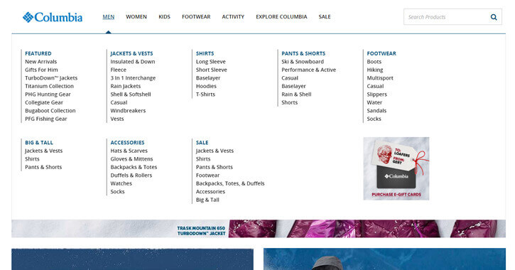
Consider the navigation menu on your website, for example. It might not be as big, but does it look anything like the nice, clean navigation below?

This nice looking navigation could be a nightmare for something with a motor disability. The links are fairly close together meaning that the clickable area of each link is pretty small and close to other alternative clickable areas.
Some individuals with motor disabilities will use keyboards to assist them, but many will not causing problems with links and clickable areas that are small.
Do you have a navigation like this? Or a resource page containing many links? If so, think about how you may be inadvertently setting a trap for some users.
Broaden your perspective by watching the video shared above but clipped to show an individual using a computer with motor disabilities:
Adults with cognitive disabilities account for approximately 10.8% or 25.3 million of the adults in the U.S.
Cognitive disabilities refer to disabilities that can range in degree from ADD to Down Syndrome and autism.
Individuals with these disabilities can struggle with:
Modifying your website to adapt to individuals with cognitive disabilities isn't as one-size-fits-all as some of the other modifications above. In fact, depending on each individual page, you may need to make different adjustments.
Here are a few possibilities:
Page and section headings throughout the website help to break up the sections of content in a lengthy page of text.
This can assist the user with overall comprehension of the content.
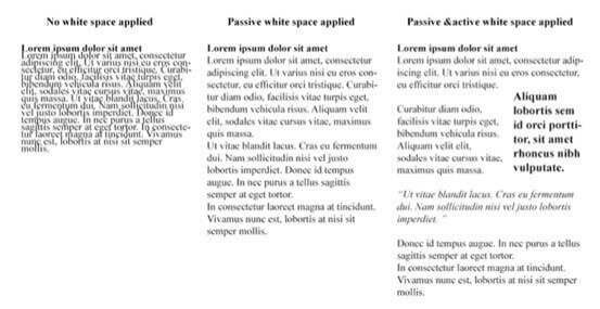
A benefit for individuals with dyslexia is to have white space surrounding sections such as blank margins separating text from other text, images, menus, etc.
In my opinion, building white space into your website design is a good habit to get into for the typical user, anyway.
Here's a great example of no-white-space v.s. white-space in text:

People who can't be forgotten when you think about making sure that your website is disability-accessible are those who may be more susceptible
more likely than most
to experiencing seizures.
These individuals may be at risk if they come across webpages containing flashing or flickering elements.
Here are a couple of extreme examples. Warning! Don't click on these links if you think you might be susceptible to photoepileptic seizures!
Other, less extreme examples
that could still cause potential problems
include:
A screen reader is a type of program that helps disabled individuals use computers. Screen readers basically just speak the content of a page.
These are, of course, vital to individuals who are effected by visual disabilities but also motor and cognitive disabilities as well as discussed previously.
While someone devoid of any disabilities will likely consume a page's content all at once (at least what's currently on the window), a disabled person using a screen reader will consume content one line at a time and in small sections.
They will also be presented the content linearly, making how the page is constructed behind-the-scenes extremely important (like we discussed in the "visual disabiilities" section).
Also, it's good to keep in mind that screen readers will ignore any visual or spatial cues and any functionality requiring a mouse.
As a website owner, keep in mind that ...


Screen readers help individuals with disabilities consume a website's content as-is. They can't fix a website or website elements that are not accessible.
I have another video for you. This one is from UC Berkeley and shows someone trying to use a website with a screen reader.
I hope that this helped you to envision what it's like for a disabled individual to use the internet.
While I want you to achieve ADA compliance by signing up for Bit Mountain and optimizing your website, I also want you to be aware of the positive impact that you'd make in the lives of 26% of your website visitors by making your website accessible.
Comments